Capturing the Essence of Porter’s Edge. How we revisited our work and designed a showroom for the next generation of tenants.
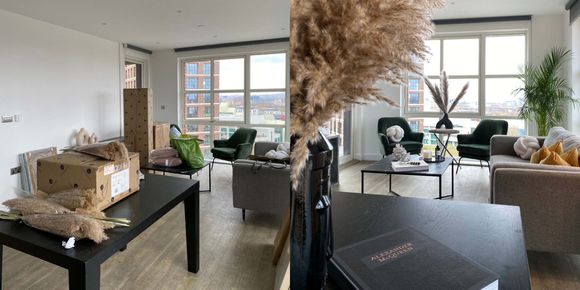
Several months ago, Folio London presented us with a unique opportunity that we simply couldn’t pass up. They had partnered with Phil Spencer’s Move iQ to film a YouTube video focusing on their flagship project – Porter’s Edge. They needed somebody to dress a show flat that would be used as an example of what living there looks and feels like. We were familiar with the development, having previously furnished it when it first opened, which made us the perfect candidate for providing the interior design.
The housing complex is a sought after place to live and apartments rarely stay unoccupied for long. We only had a couple of weeks to complete the project before the next tenants were due to move in so we knew we had to be expedient.
The first item on our design team’s list was a trip to Porter’s Edge. We inspected the area of the development, paying close attention to the people who lived there and the atmosphere. We noted the youth and vibrancy of the place, the pet-friendly premises, the peaceful lakeside location.
We visited the flat in question, which was chosen specifically for its gorgeous views and its abundance of natural light. Our team measured the spaces and noted the existing core furniture – thinking of ideas how to dress the room around it. We used that information to create a mood board for the project.
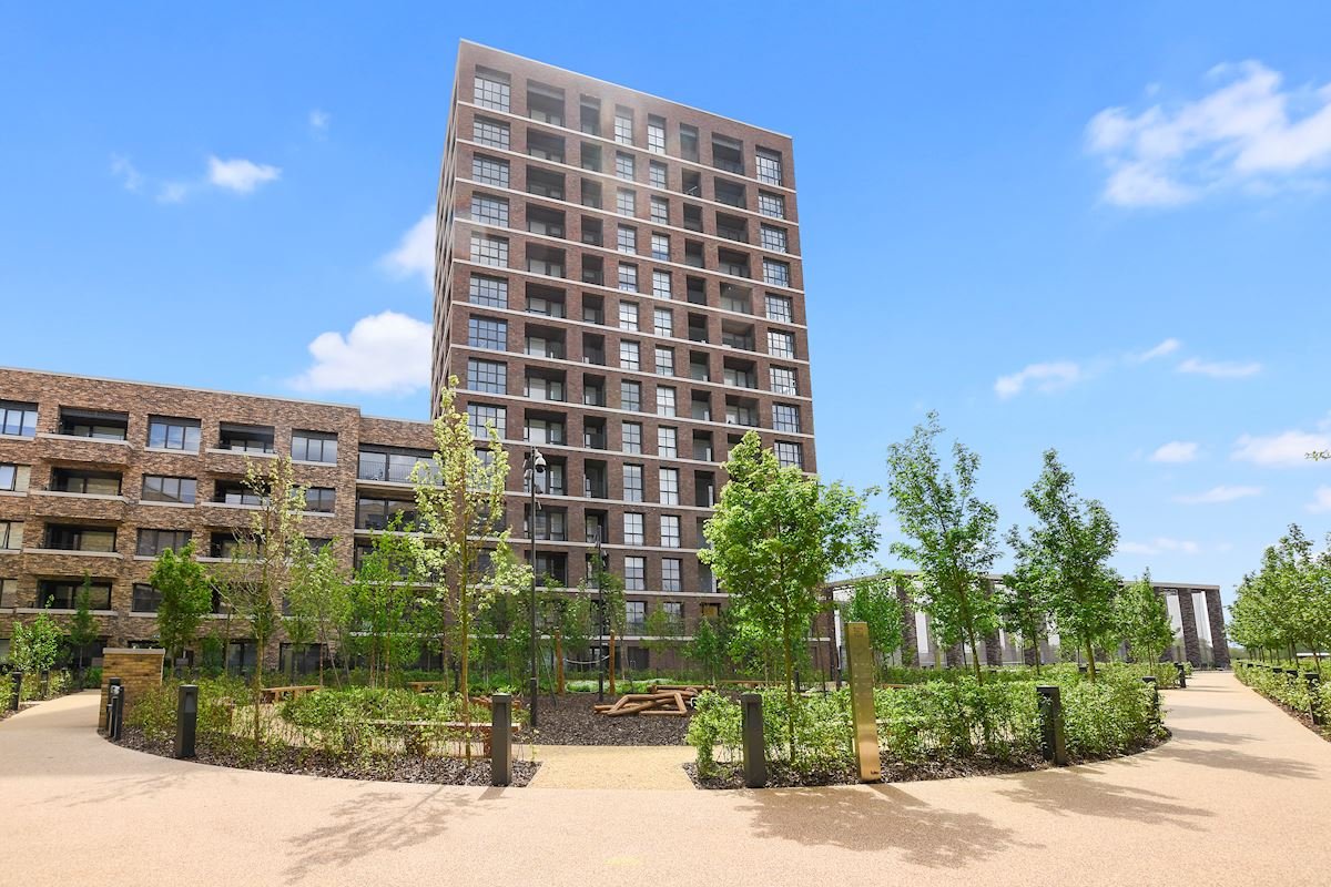
Courtesy of Folio London
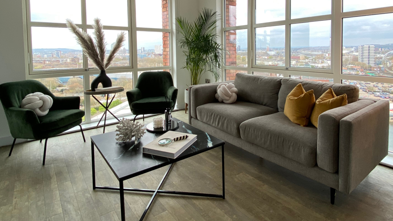
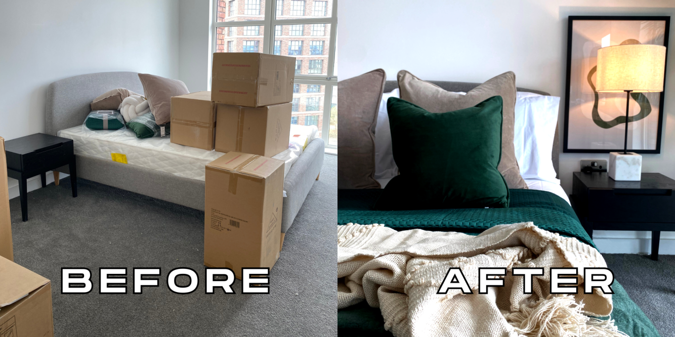
The two central motifs that our interior designers aimed to highlight were the pet-friendliness of the development and its youthful, wellness-focused character. We chose cushions and throws made from fabrics that had Martindale counts of over 50,000. This meant that they were scratch and wear-resistant and would last a long time around pets. We picked carpets that are easy to maintain and remove animal hairs from. We made sure to source the decorative pieces locally from the UK to minimise Base’s carbon footprint.
We brought some living plants and flowers for the rooms and balcony to highlight the health-focused lifestyle of the tenants and bring the serenity of the development’s small communal park and adjacent lake to the flat.
On the day of the dressing, our design team was accompanied by two of our delivery personnel. Together the teams unpacked the decorations, assembled any furniture that was needed for the video and dressed the living spaces, beautifying the core furniture and giving the flat a look of being actively inhabited. By the end of the day, the show flat had been transformed, vividly showcasing the essence and experience of living at Porter’s Edge.
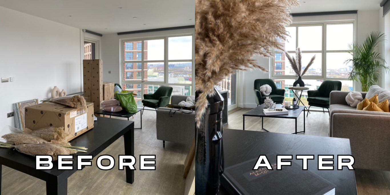
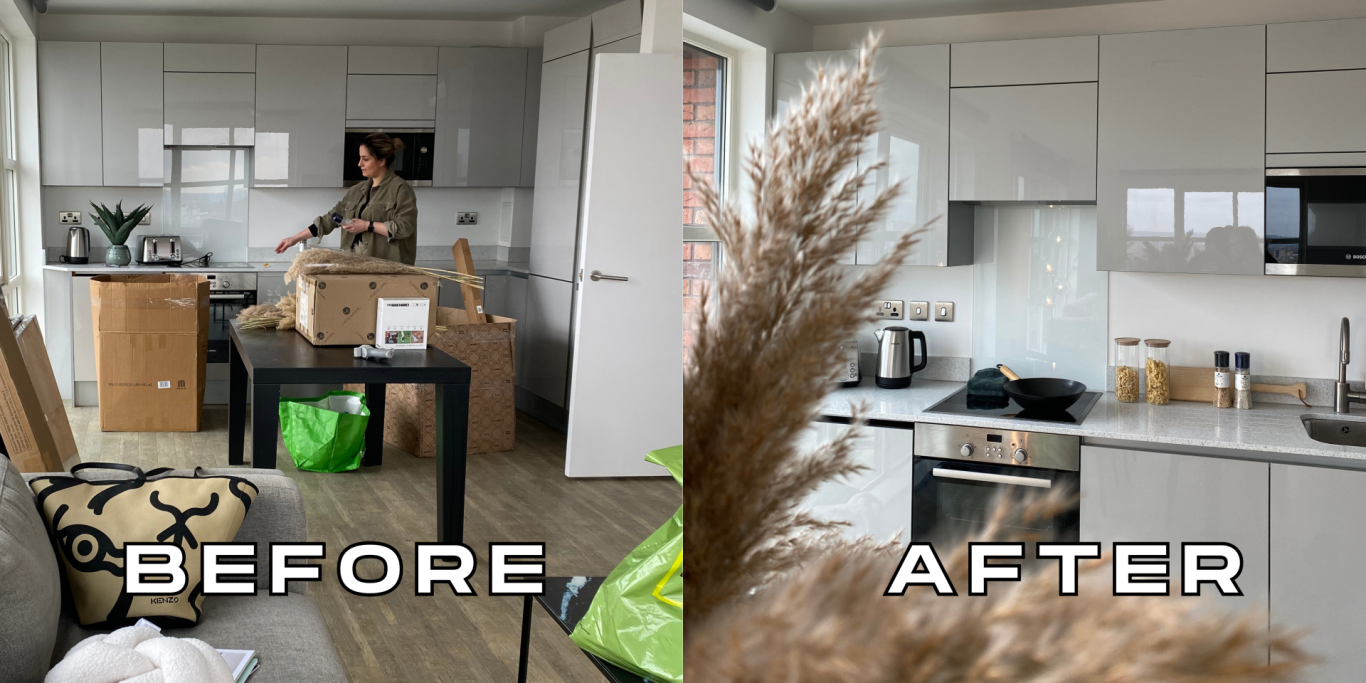
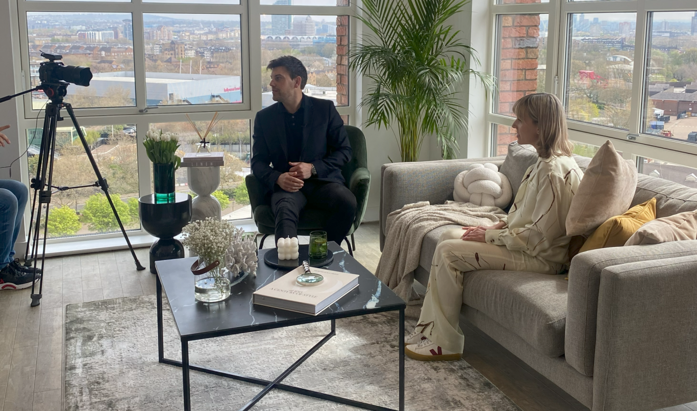
We joined Move iQ and Folio on the day of the shoot and provided the flat with a final touch. To leave a lasting impression of the youthful, wellness-oriented ambience, we prepared fruit platters adorned with succulent figs and grapes. Then it was time to sit back and let presenter Bryn Lucas and the film crew do their job. They toured the development, highlighted the different rooms of the show flat and interviewed a tenant on the experience of living in a BTR apartment and the perks that came with it such as: being allowed to have a dog and the incredible location.
We found revisiting Porter’s Edge to be a fascinating experience. We got to see how the development had evolved and transformed under the influence of its inhabitants. It gave our designers the opportunity to display their skills while also presenting them with the challenge of capturing the new face of this BTR project and showcasing it to the next generation of tenants. Participating in this project has been a valuable learning experience, providing us with a glimpse of how a BTR development evolves with the ideas of its occupants and the importance of staying relevant in the modern rental market.